Behind the Branding of AD2STL, Young Professionals Organization
By: Angela Bode, Rodgers Townsend
AD2STL is on a mission to build an organization that cultivates relationships for young professionals and build passion for continued success in their chosen field of advertising and marketing.
Well, the AD2 mark must represent nothing short of that. After trial-and-error, input from many and further consideration, each section of the AD2STL logo was carefully designed to communicate culture, community and continued learning. Here’s the thinking behind it.
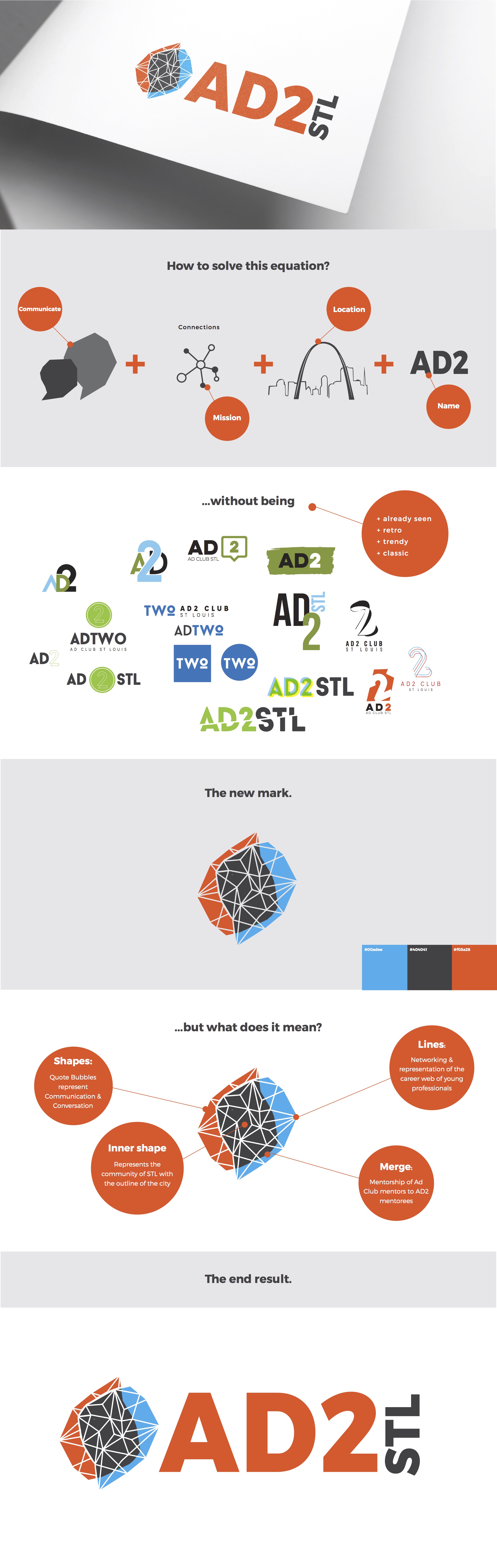
Communication and networking are at the center of this industry and happen to be just some of the foundations of AD2. The quotes above AD2STL are meant to represent those ideals with two geometric speech bubbles merged together.
Through communication, connections are formed. The geometric lines represent the many connections young professionals will make, but also represent the many things that are interwoven within building their careers. Education, skills, experience, values, interests, networks all of which establish who they are and their career paths.
Then the connections evolve into building a community. The merge of two shapes represent the shared knowledge of Ad Club STL and AD2. It is the connection of mentorship to mentees. We rely on the knowledge and connection of each other and when united, we are stronger for the community. The inner shape of the two dialog bubbles is the STL city map. Showing that when we come together we form the community.
And lastly but certainly not least, the colors. The blue is from the original Ad Club STL logo while the orange-red represents the new generation of AD2. They are spirited, assertive and hungry individuals that want to grow and develop in this industry which is boldly said with a dominant color.